
when deciding on the use and fonts it was important to consider the type of Horror we where attempting to achieve/ replicate, with this being said we has to refer to our narrative to gather this clear understanding. After much discussion amongst my group we came to a decision that is would be best if the main font for the title of our trailer would illustrate the theme of Christmas with a horror spin. With that being said we then visited the font choice site otherwise known as DaFont where we had a variety of fonts available, as shown above.
When thinking of the theme of Christmas I then went out to research fonts typically found within Christmas Films. After much analysis i found there to be a predominate use of a sharp font, much like the tyoical Christmas font known as the St.Nicholas font. Below i will include Christmas posters to demonstrate such fonts.

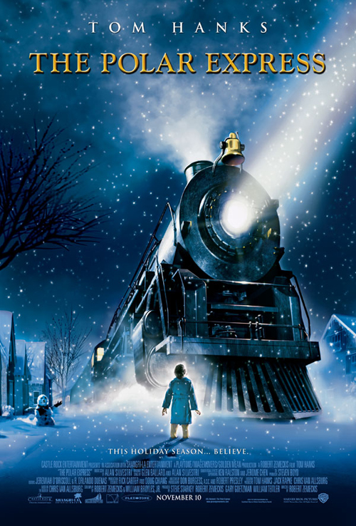
Here are two completely different Christmas themed films which both show the use of a traditional type font. this I believe is to illustrate the regal nature which surrounds the time of Christmas. Baring this in mind it is extremely important that this theme continues throughout out trailer titles so the audience will be able to pick up on the link with Christmas,
The final decision on the font can be shown in the first image, where it is Circled. To make the font appeal more the audience of the genre of horror we decided to transfer it into Photoshop where we used the editing tools available such as bevel and boss to add depth, shadows and the sharpness onto the font, with the intention to create a unique yet conventional horror Title which would be able to meet the conventions,of modern Horror film titles such as the conjuring, the last exorcist and sinister, yet being able to meet well with the hybrid genre of a paranormal Christmas themed horror trailer to which we created.


No comments:
Post a Comment