Monday, 22 February 2016

Evaluation Question 2


Evaluation: Question 1

Powered by emaze In what ways does your media product use, develop or challenge forms and conventions of real media products? note to examiner: The emaze may become slow or may not display text at all time to assure you can read each slide you may have to refresh the emzae or simply click on the square icon on the right corner of the emaze presenter.

Sunday, 21 February 2016

poster: shots taken/ mise-en-scene

Poster: Poster layout


Here we have the final product for our poster, this was made possible as a result of creating over 40 layers in Photoshop as well as using tools such as Power point to gather shapes such as the circle surrounding the main image to give an illusion of a peep whole and lettering.
in regards to getting the general layout of the poster we decided to resort back to the drawing boards and look at what is was exactly we want to produce, in regards to effectiveness. resulting us in the decision to create something which displays the villain upfront and centre. In order to implement these ideas we had to assure that this was a convention of real text. with that being said I then went on to use WEB 2.0 to find the means of such work, and after research I found that films such as the Purge and the strangers demonstrated a similar idea of a villain character being shown as a main feature.

Poster: Evidence of Photo manipulation


Here this photo demonstrates what was undertaken to create many different effects for the overall outcome of our poster. It was important to assure that photo manipulation was a key factor for our work as it would add to the depth of the photograph and therefore our overall audience will be able to identify best with this poster.
when analysing the image you will be able to see that one of our key features of photo manipulation involved us using Photoshop to edit the depth and brightness of the image. A key convention within the genre of horror can be identify as 'darkness' this can be presently illustrated through current horror films such as paranormal activity, to old horrors such as Texas Chain saw. with that being said as a collective  we decided to use the editing software available and add a filter on top using the function of bevel and boss to add a sense of depth to the image, we also chose to lower the brightness and enhance the contrast, in order to add to the mysterious effect we where looking for. This was a key element of interest for my group as our trailer surrounded the theme and element of darkness.

As you can see the overall effect has a dramatic impact on the final outcome of the image, being that the main image is always a focus point of a poster, it was important for us to create a poster with depth, leaving the overall poster more in keeping with the genre of horror

Saturday, 20 February 2016

Audience feedback: Inital reaction interview

Poster: poster link to research


This is a soundcloud deconstruction of my poster discussing any links that were made in regards to my research prior to the making the whole actual poster.

Tuesday, 16 February 2016

Evidence of Filming:Controlled use of camera work

Here we have a slideshare explaining the controlled use of camera work throughout the construction of our trailer

Evidence of Filming: Research into the use of music

when creating a trailer it became pretty apparent the impact music would have on the final outcome of the Trailer and the process of the decision on music choices will be shown through this Prezi below. With this prezi I will discuss the importance of music, the cohesive nature between narrative and sound and how we used sound research to come to a final sound decision.
Here are some contemporary trailer which implement and display effective sound tracks

Evidence of construction: sound effects

throughout our trailer the relevance of sound and music is an extremely important factor to consider, however sound effects are just as important as the value of sound and music, when including sound effects the consideration of movement is important so it was important to consider the action of the characters when placing such effects into our product. Above shows the variety of sound effects as a group we considered including into our trailer, this illustrates the process of selection to which we went through to assure we chose the most effective noises and below i will include a sound-cloud audio where you will be able to listen to the whole of our trailer. by including this you will be able to distinctly make a link between the sound effects of choice and where we chose to place different sound effects.

Monday, 15 February 2016

Poster- Titles and font use


when deciding on the use and fonts it was important to consider the type of Horror we where attempting to achieve/ replicate, with this being said we has to refer to our narrative to gather this clear understanding. After much discussion amongst my group we came to a decision that is would be best if  the main font for the title of our trailer would illustrate the theme of Christmas with a horror spin. With that being said we then visited the font choice site otherwise known as DaFont where we had a variety of fonts available, as shown above.
When thinking of the theme of Christmas I then went out to research fonts typically found within Christmas Films. After much analysis i found there to be a predominate use of a sharp font, much like the tyoical Christmas font known as the St.Nicholas font. Below i will include Christmas posters to demonstrate such fonts.
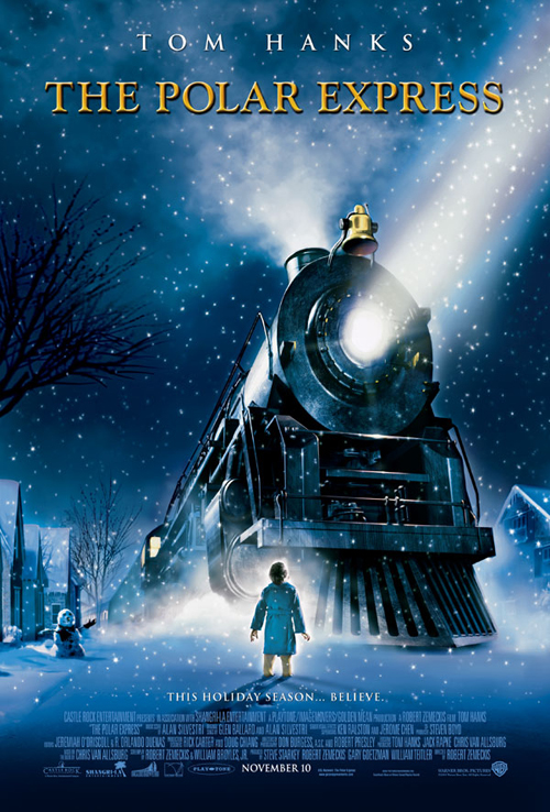
Here are two completely different Christmas themed films which both show the use of a traditional type font. this I believe is to illustrate the regal nature which surrounds the time of Christmas. Baring this in mind it is extremely important that this theme continues throughout out trailer titles so the audience will be able to pick up on the link with Christmas,

The final decision on the font can be shown in the first image, where it is Circled. To make the font appeal more the audience of the genre of horror we decided to transfer it into Photoshop where we used the editing tools available such as bevel and boss to add depth, shadows and the sharpness onto the font, with the intention to create a unique yet conventional horror Title which would be able to meet the conventions,of modern Horror film titles such as the conjuring, the last exorcist and sinister, yet being able to meet well with the hybrid genre of a paranormal Christmas themed horror trailer to which we created.